portfolio website

New Website for Veronica Thomas

Veronica was introduced to me by Boni de Laire, whose website I reconstructed in June 2014 and have maintained since then. Originally from South Africa, Veronica has lived in the States for the past 15 years. Since moving to Oregon she has been realizing her dream of becoming an artist, focusing on oil painting. When the opportunity to attend an exclusive painting workshop in Scottsdale, Arizona, arose, Veronica started looking for ways to earn some extra money to cover her travel expenses, and friends agreed to host an art salon at their home in mid-April. Mentor Boni insisted that a new website for Veronica Thomas was a must at this critical juncture, and that it be completed by the time the art salon took place so she would have an online promotional tool to work with. That’s where I entered the picture.


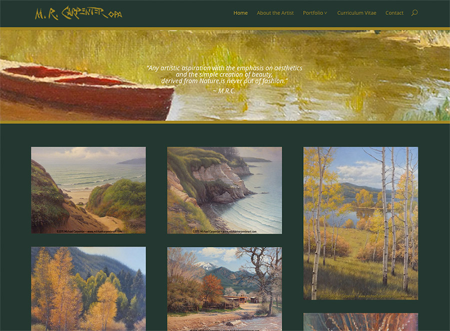
When the three of us sat down to discuss the project, I showed them the last site I had completed, www.michaelcarpenterart.com. Veronica liked it so much she went straight for a similar design using the same theme, Divi, by Elegant Themes. As with all my other clients, Veronica’s site was equipped with a full suite of plugins for search engine optimization, page loading speed, social sharing, and of course security to protect the website and its visitors.


One of the fun things we incorporated was a Google font with a special effect, accomplished with a css styling trick. Veronica wanted the headings to match the branding on the invitation mailers, flyers, and business cards that her daughter Chloe had developed for her. It wasn’t available as a Google font, but they wree able to find one that was so similar one can hardly tell it’s not the same. The other challenge was that Veronica wanted the header with the effect on the home page, but without the effect on all the other pages. Not only was I able to pull this off successfully, but the research and the execution went very quickly, so it wasn’t a spendy experiment either. I love how my clients push me to learn new things with their challenges! Another arrow in my quiver…


The one sticky part of the Divi theme seems to be the banner space. It’s a bit unpredictable how much of an image will appear in this space in a desktop browser, yet the entire image will show in a mobile browser.  I can do quite a bit of customizing, but it’s still tricky. Chloe is proficient with image editing and social media, so she was a huge help in this regard. In the end, our collaboration again resulted in a new website for Veronica Thomas in which we all take a considerable amount of pride. It was completed and launched well before her deadline, Veronica sold enough paintings at her art salon to help cover her expenses during the workshop in Scottsdale, and she is now busily absorbing all the new information she possibly can in Arizona! We will be doing the first update on her site once she returns to indicate which paintings have been sold. Meanwhile, here are screenshots of Veronica’s new website as launched on April 17, 2015. You can click these to view larger versions, and there is a link to the live website in the paragraph below.


veronicathomasart.com, new website for artist Veronica Thomas created and launched in April 2015 by Hannah West using a customized version of the Divi theme.
Website created for artist Veronica Thomas in April 2015 by Hannah West.
Screenshot of Veronica's Bio page, showing the difference in the heading style from the Home page
Screenshot of Veronica’s Bio page, showing the difference in the heading style


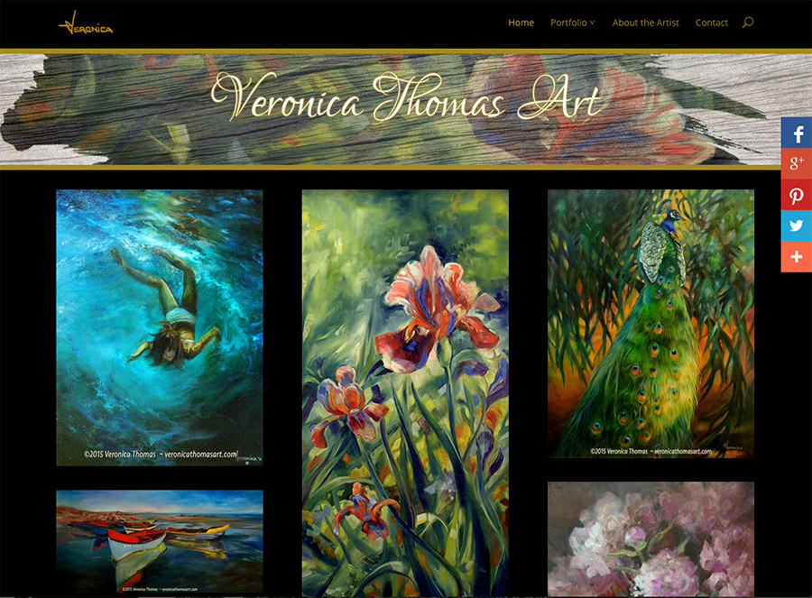
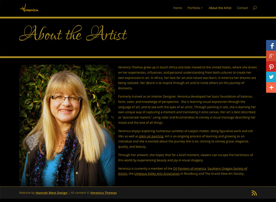
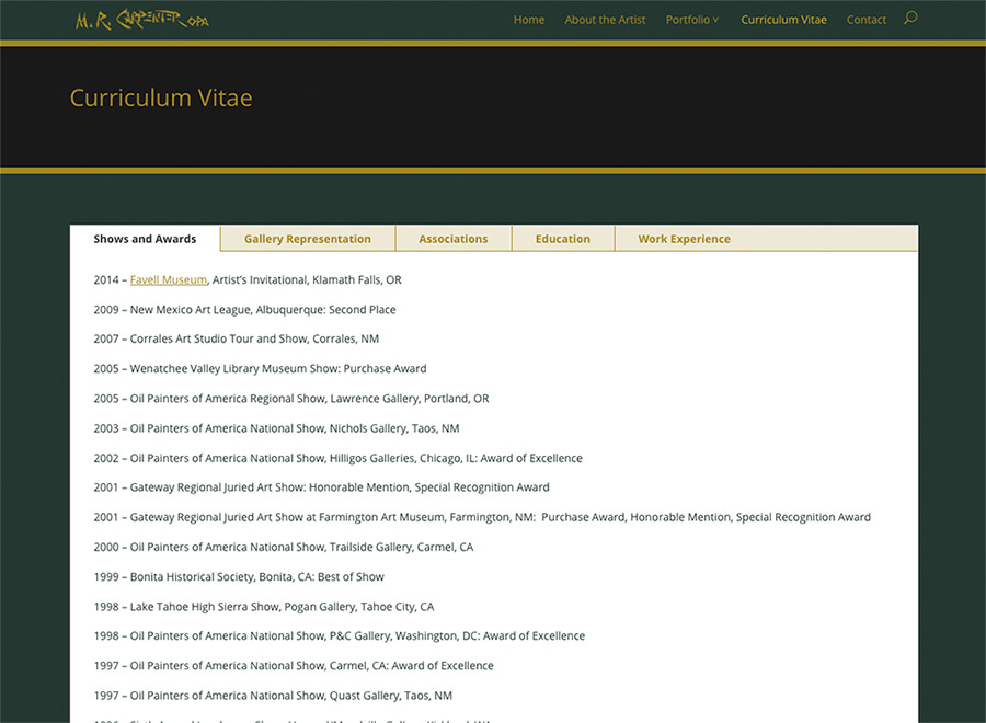
Please visit Veronica’s website and help it gain momentum with viewers online and the search engines. Her artwork is beautiful and, from children to wildlife and still life to plein air landscapes, she paints such a wide variety of subjects that it took eight portfolio categories to accommodate them all! Her site is another beautiful example of how the Divi theme can be customized for various purposes. If you would like to see examples of how I have used and customized Divi in other projects, click the links in the sidebar for fashion jewelry designer www.wendygell.com (including e-commerce shop), portfolio galleries of landscapes in oil at www.michaelcarpenterart.com, soft and lovely watercolor portfolios at www.judybuswell.com, presentations for harp strings and related products and information at markwoodstrings.com and the spectacular Mountain Glen Harps website, with one of the most amazing home pages I’ve made to date. This last one is a great way to see what’s possible with Divi.


If you like Divi’s flexibililty but would like to see an alternative, I have used a similar, and very popular, premium theme called Avada which I purchased at Theme Forest to create www.jacksonvillechiropracticclinic.com (very professional and takes advantage of numerous shortcodes in the design), and the gorgeous nonprofit ecommerce site www.missioncandles.com, probably the most beautiful site I’ve created yet. I enjoy working with both of these themes and though there are many themes out there I’d love to play with, I do hope to use the truly premium quality Avada again in the near future.


Friends take care of friends and extend the family. I’m so happy to have gotten to know Veronica and look forward to an ever-deepening friendship with her. Many grateful thanks to my dear friend and talented artist Boni dé Laire for referring Veronica to me! Please visit Boni’s website to see her amazing landscapes in oil. You will not be disappointed, they are truly spectacular and we will be adding a new painting soon!


New website for Michael Carpenter

One of the things I like about my work is that I’m often asked to update or create a new website for an artist who has just moved into my area. It’s a great way to make new friends and keep a finger on the pulse of the arts. Creating a new website for Michael Carpenter in March/April 2015 was one of those “welcoming committee” assignments. Michael Carpenter and his lovely wife lived in Portland for much of Michael’s professional career as a successful graphic designer. They have spent a good deal of time in California and New Mexico since he retired and began devoting his time to the fine art oil painting that fired his passion for art as a young man. They moved here recently, and decided it was time for Michael to establish a presence online. Many thanks to artist and plein air painter Norm Rossignol for referring Michael to me!


Michael is not an emerging artist. His experience, skill and diligent study as well as a very refined eye are evident in all his work, so building a new website for him was a real treat for an artist and art enthusiast like me. I prepared a total of 77 images for this project, 36 images of original oil paintings for the website and the rest, images of paintings that are now only available as prints for Michael’s promotional use. That was a LOT of eye candy to soften the technical end of the work for me! And it felt good to be protecting them with the addition of internal metadata and a visible copyright/website address to each image. A little cropping and adjusting to the images themselves was required, though not too much as they were in very good shape when they came to me. A total of about 15 minutes per image on average to make them fully web-worthy and ready to add.


On the technical end, Michael’s site was built with a complete suite of plugins chosen for various back end functionalities, including a complete security setup, search engine optimization, Google analytics, and caching for consistent performance and page loading speed. More too, but surely that is boring to most readers. What’s not boring at all are the three portfolio galleries of his paintings, displaying his work in Still Life, Landscapes and Waterscapes categories. His home page displays a few images from each category to give you an idea of what you will find as you continue to explore the site. These image galleries are presented in the new “masonry” style, which I’m very grateful for as it shows each image in its entirety—no unpredictable cropping that deprives visitors of a glance at each painting in its fullness before clicking to view and enlargement. A bio page to learn more about the artist, a customized CV page which includes his shows, distinctions and awards, and a contact page round out the presentation on Michael Carpenter’s new website.


Michael’s site received a fair amount of attention when it came to customizing the theme. By default a white background and very modular, the newer Divi theme by Elegant Themes is becoming very popular with my clients for its very nice portfolio layouts. These don’t come with the theme by default, but are available in a separate download if you look hard enough for it. Divi is also a responsive theme, so Michael would emerge on the internet ready for Mobilegeddon with a theme that looks fabulous on both desktop and mobile devices. Michael chose a deep green background with black banner areas and gold text, adding custom gold accents to the theme itself as well. What a great call! The site looks very elegant and refined, and quite masculine without being “strong.” An effective, subtle and understated setting for his wonderful paintings. We “lifted” his signature from a painting and turned it into a site logo and customized a number of additional elements throughout the theme.


Even the parallax site banner, which opens the site with an accompanying quote from the artist, got a lot of scrutiny and adjustments before it was just right. We had to make some compromises on this important detail due to the difference in how its displays on mobile and desktop browsers. No one really likes making that kind of compromise, but when we were finished Michael was satisfied that it looked the best it could across the range of device sizes. In the end our collaboration resulted in a beautiful new website for Michael Carpenter that we are both proud to present. Where’s the champagne?!


New website, new friends…without any further adieu, here’s a glimpse of Michael’s new website home page, and a few features that people interested in a new website might like to see. You can click therse for a larger image, but please take a little bit of time to visit the live site at www.michaelcarpenterart.com, enjoy all his paintings, and inspect the various features of the website. Who knows, you might find a painting you can’t live without! If you’re an artist, particularly if you paint en plein air, you will find much of interest in his work to be inspired by. Thanks so much for entrusting me with this project, Michael!

Screenshot of www.michaelcarpenterart.com homepage, created by Hannah West Design in April 2015
Screenshot of www.michaelcarpenterart.com homepage, launched April 2015
Curriculum Vitae page. www.michaelcarpenterart.com
Curriculum Vitae page, www.michaelcarpenterart.com